Improved conditional formatting in Excel For Better Data Visualization
 Conditional formatting makes it easy to emphasize important cells or ranges of cells, highlight unusual values, and visualize data by using data bars, color scales, and icon sets. In each newer version of Excel, it includes further more formatting flexibility. Conditional formatting is one module in our Advanced Excel Training in Singapore — 3 days hands-on.
Conditional formatting in Excel is a powerful feature that allows you to automatically apply formatting to cells based on specific conditions.
It’s a fantastic tool for visualizing data trends, highlighting important information, and making your spreadsheets more informative and user-friendly.
If you want to join our Excel courses in Singapore & improve your skills, we have multiple choices available
Here are some of the best ways to use conditional formatting, along with concrete examples:
- Color Scale for Data Ranges:
- Use a color scale to visually represent the distribution of data values within a range.
- Example: Apply a green-to-red color scale to a list of temperature readings to quickly identify hot and cold temperatures.
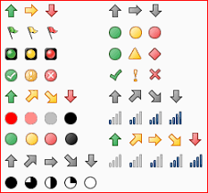
- Icon Sets for Comparisons:
- Apply icon sets to cells to compare values and show trends using icons like arrows or traffic lights.
- Example: Use upward and downward arrows to indicate whether sales figures have increased or decreased compared to the previous month.
- Data Bars for Proportional Data:
- Use data bars to create horizontal bars within cells to represent the proportional value of each cell compared to others.
- Example: Apply data bars to visualize the relative sizes of monthly expenses in a budget spreadsheet.
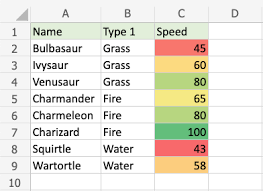
- Highlighting Duplicates and Unique Values:
- Apply conditional formatting to highlight duplicate or unique values in a range of cells.
- Example: Highlight duplicate names in a list of customers to identify potential data entry errors.
- Color-Coded Prioritization:
- Use conditional formatting to color-code cells based on priority levels, making it easy to identify important tasks or items.
- Example: Color-code tasks in a to-do list as high, medium, or low priority.
- Custom Formulas for Complex Conditions:
- Create custom formulas for more complex conditions that aren’t covered by built-in formatting rules.
- Example: Apply conditional formatting to highlight cells with values greater than the average of a range.
- Highlighting Dates:
- Apply conditional formatting to highlight dates that fall within a certain range, such as upcoming deadlines or overdue dates.
- Example: Use red formatting to highlight dates that are past the current date in a project timeline.
- Data Validation Feedback:
- Use conditional formatting to provide feedback on data validation rules, making it clear why certain entries are invalid.
- Example: Apply a red border to cells that contain text longer than a specified character limit.
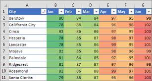
- Heat Maps for Data Analysis:
- Create heat maps by applying conditional formatting to visualize patterns and trends in large datasets.
- Example: Apply color scales to sales data to quickly identify regions with the highest and lowest sales figures.
- Formula-Based Alerts:
- Use conditional formatting to trigger alerts or notifications based on specific formula-driven conditions.
- Example: Apply a bold font and red text to cells where inventory levels are below a certain threshold.
Key to effective conditional formatting is to choose formatting options that align with your goals and data presentation needs. By using conditional formatting strategically, you can make your data more visually engaging and facilitate better decision-making.
New icon sets: In Excel, we can access to more icon sets, including triangles, stars, and boxes. We can also mix and match icons from different sets and more easily hide icons.
For example, we might choose to display icons only for high profit values and remove them for middle and lower values.
More options for data bars: Excel now comes with new formatting options for data bars. You can apply solid fills or borders to the data bar, or set the bar direction from right-to-left instead of left-to-right.
Not only that, data bars for negative values appear on the opposite side of an axis from positive values.
 If you would like to learn more about these new features of Microsoft Excel for data analysis and data visualization or would like to attend the Microsoft Excel Training, do contact us at Intellisoft Systems.
If you have any further questions then contact us through email training@intellisoft.com.sg or call at +65 6250-3575!!!
The Best Trainer for Advanced Data Analytics With Excel in Singapore
Mr. Vinai, Prakash the founder of Intellisoft Systems teaches Advanced Excel Techniques, Dashboard Techniques using Excel, Data Interpretation and Analysis Training courses at Intellisoft.
He has trained over 15,000 students in over 18 countries, and regularly conducts Excel Workshops in Singapore, Malaysia, Indonesia, Australia, India, Dubai, Egypt, Zimbabwe, South Africa etc.