How To Calculate CPF Contribution With Excel [2024 Update]

How To Calculate CPF Contribution Using Microsoft Excel - Free Template in Excel

UPDATED FOR CPF CONTRIBUTION RATE CHANGES FROM THE YEAR 2024

How To Calculate CPF Contribution Using Microsoft Excel - Free Template in Excel
How To Calculate CPF Contribution Using Microsoft Excel – Free Template in Excel

Learn how to Calculate CPF contribution for Employees and Employers in Singapore by using Microsoft Excel. This covers Singapore Citizens and Singapore Permanent Residents SPRs.

If you want to join our Excel course in Singapore & improve your skills, we have multiple courses – Basic Excel for Analytics, Advanced Excel Courses in Singapore & VBA Macro Programming Courses.

Singapore CPF Rules
In Singapore, all salaried employees need to contribute 5-20% of their salary, depending on age to their Central Provident Fund or CPF. The employer contributes 7.5% to 17% of the salary to the CPF Fund, depending on the age of the worker.

The CPF contribution calculator for employers and employees can be done using Microsoft Excel.

CPF contribution calculator Excel File is available for download below.

Employee’s age
(years)
CPF Contribution Rates changes from 1 Jan 2022
(monthly wages > $750) Based on CPF Board
Total
(% of wage)
By employer
(% of wage)
By employee
(% of wage)
55 & below 37 17 20
Above 55 to 60 28 14 14
Above 60 to 65 18.5 10 8.5
Above 65 to 70 14 8 6
Above 70 12.5 7.5 5
Excel for HR Professionals

So payroll executives from Finance or HR professionals need to calculate the correct amount for the contribution to CPF, and provide the net salary to the employees who are Singapore Citizens or Singapore Permanent Residents (SPR). The employer also needs to know their total payroll expenses so as to know their Payroll Liability each month.

Calculating CPF Rates for Employees & Employers in Singapore
I have created a simple Excel spreadsheet to calculate the CPF Rates and Amounts in Singapore in this matter. If you wish to use this you can fill in your own Singapore Citizen & PR employee’s details, their age & basic pay, and the following is automatically calculated:

Learn Microsoft Excel 2019
Learn Advanced Excel 2019 @Intellisoft
  • Employee’s contribution,
  • The employer contribution,
  • Total CPF contributions,
  • Total payable to CPF,
  • Net salary to the employee
  • Gross Salary expense of the employer

The spreadsheet uses simple formulas that are already pre-programmed. So you can just begin to use this spreadsheet for your company.  It has been tested for CPF Contribution Rates in 2022 and beyond, and everything will work smoothly.

Increase in CPF contribution rates from 1 January 2022

  • The CPF contribution rates for employees aged above 55 to 70 have been increased.
  • The increase in the CPF contribution rates will be fully allocated to the employees’ Special Accounts to provide a bigger boost to their retirement income.
  • For those earning monthly wages of more than $500 to $750, the employee contribution rates will continue to be phased in.
  • There are no changes to the graduated contribution rates for first and second year Singapore Permanent Residents (SPRs). 

If you need any enhancements in calculating employee CPF & contributions payable for Payroll expenses for companies in Singapore or have any comments, do let us know. You can leave a comment below this post.

And of course, if you wish to learn how to create such excel spreadsheets, and use simple Microsoft Excel formulas and functions, you can also attend our Microsoft Excel Training classes in Singapore.

Advanced Excel 2019 Course (2 Days) – with SDF Funding

Basic / Intermediate Excel 2019 Training (2 Days) – With SDF Funding

Advanced Excel for HR Professionals (2 Day Classroom Training)

Hope you like this CPF Calculator Singapore Excel Template for calculating the CPF in Singapore. If you like it, I would appreciate it if you Like Us on Facebook, and leave a comment below!

Cheers,
Vinai Prakash, MBA, PMP, ITIL, GAP, Six Sigma
Master Trainer, Intellisoft Systems

Vinai teaches Advanced Excel Techniques, Dashboard Techniques using Excel, Data Interpretation and Analysis Training courses at Intellisoft. He has trained over 25,000 students in over 28 countries and regularly conducts Excel Workshops in Singapore, Malaysia, Indonesia, Australia, India, Dubai, Egypt, Zimbabwe, South Africa etc.

Contact Intellisoft to book a Certified Microsoft Excel Trainer for your Training needs.

DOWNLOAD EXCEL CPF CALCULATOR

Sparklines in Microsoft Excel to Visualize Data Quickly

Sparklines in Microsoft Excel Traiing

In Microsoft Excel, some of the new features introduced in the past 15 years are amazing for every day use. Spark lines and Slicers are some of these amazing gems of Excel.

These improvements to PivotTables and other existing features, can help us to discover patterns or trends in the data. To get started with the features of Excel, first we will look at the details of the  Sparkline and slicers features of Excel.

What are Spark lines in Excel, and How to Use Them

Sparkline in Excel
Sparkline in Excel

Sparklines are tiny charts that is used to fit in a cell to visually summarize trends beside the data. 

Sparklines are an extremely useful and user friendly feature in Microsoft Excel that allow you to create small, visual representations of data trends within individual cells.

These tiny charts provide a compact way to display trends, variations, and patterns in your data without taking up a lot of space. Sparklines are particularly useful when you want to quickly analyze data at a glance or within a confined area, such as a cell or a small column.

There are three main types of sparklines in Excel:

  1. Line Sparklines: Line sparklines show trends over a period of time. They are typically used to display data points in a line chart format, helping you visualize trends, fluctuations, and patterns over time.
  2. Column Sparklines: Column sparklines are used to compare values among different data points. They can help you identify variations and relative sizes of data within a specific context.
  3. Win/Loss Sparklines: Win/loss sparklines are used to represent binary data, often indicating “win” or “loss” scenarios. These are typically shown using icons or symbols to denote positive or negative outcomes.

Since sparklines show trends occupies less space, they are exclusively useful for dashboards and other places where we need to show a glimpse of the business in an simple practical visual format.

In the image to the left, the sparklines that appear in the Trend column lets us have a quick look of the performance of each department in the month of May.

If you want to join our Excel course in Singapore & improve your skills, we have multiple courses – Basic Excel for Analytics, Advanced Excel Courses in Singapore & VBA Macro Programming Courses.

Key features and benefits of Spark Lines in Excel include:

  • Compact Representation: Sparklines are designed to fit within individual cells, making them an efficient way to provide data insights in a constrained space.
  • Visual Analysis: By using simple visual cues, sparklines allow you to quickly identify trends and patterns, even without delving into detailed data analysis.
  • Easy to Create: Creating sparklines in Excel is straightforward. You can insert sparklines through the “Sparkline Tools” tab on the Excel ribbon after selecting the data range you want to visualize.
  • Dynamic Updates: Sparklines are dynamic, meaning they update automatically when you change the data or adjust the range they’re based on.
  • Conditional Formatting: You can apply conditional formatting to sparklines, enhancing their visual impact. For example, you can color-code sparklines based on specific conditions, making trends more apparent.
  • Compatibility: Sparklines are available in most modern versions of Excel, including Excel 2010 and later.

To Create Spark lines in Excel:

  1. Select the cell where you want the sparkline to appear.
  2. Go to the “Insert” tab on the Excel ribbon.
  3. In the “Sparklines” group, choose the type of sparkline you want (Line, Column, or Win/Loss).
  4. Select the data range you want to visualize.
  5. Click “OK,” and the sparkline will be generated within the selected cell.

Remember that while sparklines provide a quick and visual overview of data trends, they might not replace the depth of analysis that larger charts or graphs can offer. Use sparklines in scenarios where space is limited and you need to provide a concise snapshot of data trends.

When and where is the best use of Excel sparklines

Excel sparklines are best used in situations where you need to provide a quick and concise visual representation of data trends within a limited space.
They are particularly effective when you want to highlight trends, variations, and patterns in your data without the need for extensive data analysis. Here are some scenarios where Excel sparklines can be most beneficial:
  1. Dashboards and Reports: Sparklines are ideal for creating dashboards and reports that require a compact presentation of key performance indicators (KPIs) and trends. You can include multiple sparklines in a small area to provide an overview of various metrics.
  2. Tables and Data Lists: When working with data tables or lists, you can add sparklines next to numeric data to provide context and visual insight into how values are changing over time or between categories.
  3. Financial Data: Use sparklines to visualize changes in financial data, such as stock prices, revenue, expenses, or budget allocations. Line sparklines can help show trends over time, while column sparklines can highlight variations between categories.
  4. Project Management: Incorporate sparklines in project management to illustrate task completion, project progress, or resource allocation. For instance, you can display task completion rates using win/loss sparklines.
  5. Sales and Marketing: Use sparklines to represent sales figures, conversion rates, or website traffic data. These visualizations can help sales and marketing teams quickly assess performance.
  6. Comparative Analysis: When comparing data sets or categories, column sparklines can show relative values and trends, making it easy to identify patterns and outliers.
  7. Scorecards: In performance scorecards or performance reviews, sparklines can visually summarize an individual’s progress or achievement over time.
  8. Educational Purposes: Sparklines can be used in educational materials to help students understand data trends and patterns, making learning about data analysis more engaging.
  9. Emails and Presentations: Incorporate sparklines in emails or presentations to provide a quick visual representation of data trends without overwhelming the audience with extensive charts.
  10. Data Visualization in Cells: In spreadsheets where you need to keep the data and visualizations together, sparklines offer a convenient way to incorporate visual insights directly into the data cells.

While sparklines are excellent for providing quick insights, they might not replace the need for more detailed charts and graphs in situations where deeper analysis is required.

Additionally, when using sparklines, it’s essential to ensure that the data you’re visualizing is appropriate for the type of sparkline you’re using (line, column, or win/loss) to ensure accurate representation.

What are Slicers in Microsoft Excel

Excel Slicers Sample

Slicers are visual controls. They let us quickly refine data in a PivotTable in an interactive, automatic manner. If we insert a slicer, we can use buttons to quickly segment and refine the data to display appropriate results.

Not only that, when we apply more than one filter to the PivotTable, we no longer have to open a list to see which filters are enforced to the data. Rather, it is displayed on the screen in the slicer.

We can make slicers relate to the workbook formatting and easily reuse them in other PivotTables & PivotCharts.

Slicers provide an intuitive and user-friendly way to filter and analyze data without the need to access complex filter menus or dialogs.

Slicers create buttons or visual elements that you can click or select to filter data, making data analysis more dynamic and accessible.

When you insert a slicer into an Excel workbook, it creates a dashboard-like interface where users can easily filter data by clicking on specific elements. Slicers are especially useful for large datasets and complex reports where traditional filtering methods might be cumbersome.

When to Use Slicers in Excel:

  1. Pivot Tables and Pivot Charts: Slicers are primarily designed to work with pivot tables and pivot charts. They enhance the usability of these tools by providing a simple way to filter and slice data dynamically.
  2. Large Datasets: When dealing with large datasets, using traditional filter dropdowns can be overwhelming. Slicers offer a more user-friendly experience by visually representing filtering options.
  3. Interactive Dashboards: If you’re creating interactive dashboards or reports, slicers can be a great addition. Users can quickly filter data to focus on specific aspects of the report.
  4. Data Exploration: When you want to explore data trends and patterns quickly, slicers allow you to filter data on the fly without the need to constantly modify filter settings.
  5. Collaborative Work: Slicers are particularly useful in collaborative environments where multiple users need to analyze data. They provide a consistent and easy-to-understand filtering interface.
  6. Sales and Marketing Analysis: Slicers are beneficial for sales and marketing reports where you want to analyze data by different criteria such as time periods, regions, products, or customer segments.
  7. Comparative Analysis: Slicers can be used to compare data across different categories, allowing you to instantly switch between various data subsets for comparison.
  8. Data Visualization: When creating presentations or reports for non-Excel users, slicers provide a more intuitive way to interact with and explore data.

How to Use Slicers in Excel:

  1. Create a Pivot Table or Pivot Chart: Before adding slicers, you need to create a pivot table or pivot chart based on your data.
  2. Insert Slicer: Go to the “PivotTable Analyze” or “Analyzing” tab on the Excel ribbon, then click on the “Insert Slicer” button. Choose the fields you want to use as slicers.
  3. Arrange Slicers: Once inserted, arrange the slicers on your worksheet as needed. You can resize them, move them around, and align them to create an organized layout.
  4. Filter Data: When you interact with a slicer by clicking on an element (e.g., selecting a specific category or time period), the associated pivot table or pivot chart will instantly update to show the filtered data.
  5. Multiple Slicers: You can insert multiple slicers based on different fields to provide more comprehensive filtering options.

Remember that while slicers are a fantastic tool for interactivity and data analysis, they are best suited for scenarios involving pivot tables and pivot charts. For traditional data tables, you might want to stick with standard filtering options.

excel trainingIf you would like to learn more about these new features of Microsoft Excel, or would like to attend the Advanced Microsoft Excel Training, do contact us at Intellisoft Systems.

If you have any further questions or want to join a training on how to use Sparklines, contact Intellisoft for Corporate Training on Excel or call at +65 6250-3575.

Trainer: We have certified trainers who excel in imparting their knowledge and are very patient. Master Trainer Vinai teaches Advanced Excel Techniques, Dashboard Techniques using Excel,  Advanced Data Analytics & Data Visualization Training courses at Intellisoft.

Vinai has trained over 15,000 students in over 18 countries, and regularly conducts Excel Workshops in Singapore, Malaysia, Indonesia, Australia, India, Dubai, Egypt, Zimbabwe, South Africa etc.

Conditional Formatting in Microsoft Excel For Better Data Visualization

Conditional Formatting in Excel using Color Scales for Data Visualization Training

Improved conditional formatting in Excel For Better Data Visualization

Conditional Formatting in Excel - Sample ScreenshotConditional formatting makes it easy to emphasize important cells or ranges of cells, highlight unusual values, and visualize data by using data bars, color scales, and icon sets. In each newer version of Excel, it includes further more formatting flexibility.

Conditional formatting in Excel is a powerful feature that allows you to automatically apply formatting to cells based on specific conditions.

It’s a fantastic tool for visualizing data trends, highlighting important information, and making your spreadsheets more informative and user-friendly.

If you want to join our Excel course in Singapore & improve your skills, we have multiple courses – Basic Excel for Analytics, Advanced Excel Courses in Singapore & VBA Macro Programming Courses.

Here are some of the best ways to use conditional formatting, along with concrete examples:

Color Scales in Excel Conditional Formatting

  1. Color Scale for Data Ranges:
    • Use a color scale to visually represent the distribution of data values within a range.
    • Example: Apply a green-to-red color scale to a list of temperature readings to quickly identify hot and cold temperatures.
  2. Icon Sets for Comparisons:
    • Apply icon sets to cells to compare values and show trends using icons like arrows or traffic lights.
    • Example: Use upward and downward arrows to indicate whether sales figures have increased or decreased compared to the previous month.
  3. Data Bars for Proportional Data:
    • Use data bars to create horizontal bars within cells to represent the proportional value of each cell compared to others.
    • Example: Apply data bars to visualize the relative sizes of monthly expenses in a budget spreadsheet.
  4. Highlighting Duplicates and Unique Values:
    • Apply conditional formatting to highlight duplicate or unique values in a range of cells.
    • Example: Highlight duplicate names in a list of customers to identify potential data entry errors.
  5. Color-Coded Prioritization:
    • Use conditional formatting to color-code cells based on priority levels, making it easy to identify important tasks or items.
    • Example: Color-code tasks in a to-do list as high, medium, or low priority.
  6. Custom Formulas for Complex Conditions:
    • Create custom formulas for more complex conditions that aren’t covered by built-in formatting rules.
    • Example: Apply conditional formatting to highlight cells with values greater than the average of a range.
  7. Highlighting Dates:
    • Apply conditional formatting to highlight dates that fall within a certain range, such as upcoming deadlines or overdue dates.
    • Example: Use red formatting to highlight dates that are past the current date in a project timeline.
  8. Data Validation Feedback:
    • Use conditional formatting to provide feedback on data validation rules, making it clear why certain entries are invalid.
    • Example: Apply a red border to cells that contain text longer than a specified character limit.
  9. Heat Maps for Data Analysis:
    • Create heat maps by applying conditional formatting to visualize patterns and trends in large datasets.
    • Example: Apply color scales to sales data to quickly identify regions with the highest and lowest sales figures.
  10. Formula-Based Alerts:
    • Use conditional formatting to trigger alerts or notifications based on specific formula-driven conditions.
    • Example: Apply a bold font and red text to cells where inventory levels are below a certain threshold.Icons for use in Conditional Formatting of Data in Excel

Key to effective conditional formatting is to choose formatting options that align with your goals and data presentation needs. By using conditional formatting strategically, you can make your data more visually engaging and facilitate better decision-making.

New icon sets: In Excel, we  can access to more icon sets, including triangles, stars, and boxes. We can also mix and match icons from different sets and more easily hide icons.

For example, we might choose to display icons only for high profit values and remove them for middle and lower values.

More options for data bars: Excel now comes with new formatting options for data bars. You can apply solid fills or borders to the data bar, or set the bar direction from right-to-left instead of left-to-right.

Not only that, data bars for negative values appear on the opposite side of an axis from positive values.

excel trainingIf you would like to learn more about these new features of Microsoft Excel for data analysis and data visualization or would like to attend the Microsoft Excel Training, do contact us at Intellisoft Systems.

If you have any further questions then contact us through email training@intellisoft.com.sg or call at +65 6250-3575!!!

The Best Trainer for Advanced Data Analytics With Excel in Singapore

Mr. Vinai, Prakash the founder of Intellisoft Systems teaches Advanced Excel Techniques, Dashboard Techniques using Excel, Data Interpretation and Analysis Training courses at Intellisoft.

He has trained over 15,000 students in over 18 countries, and regularly conducts Excel Workshops in Singapore, Malaysia, Indonesia, Australia, India, Dubai, Egypt, Zimbabwe, South Africa etc.

Pivot Tables in Microsoft Excel For Fast Data Analysis

Excel Pivot Table Training Singapore

Excel Pivot Tables help us to discover patterns or trends in the data.

Here is a quick tutorial on Pivot Tables in Excel which highlights the new features added in Microsoft Office 365, Office 2019, and Microsoft Office 2016 or earlier versions of Excel.

Earlier we had a look at the Sparklines and Slicers features of Excel so now we will look at the improved pivot table feature of excel.

Excel Pivot Table Training Singapore

Learn Improved Pivot Tables in Excel

PivotTables are now easier to use and more responsive. Key improvements include:

Excel Pivot Table Training
Lesser-Known Features of Microsoft Excel
  • Performance enhancements: In Excel, Multi-threading helps advanced  sorting, data retrieval and filtering in Pivot Tables.
  • Write-back support: In Excel, we can update values in the OLAP PivotTable Values area and then transferred to the Analysis Services cube on the OLAP server. We can use the write-back feature in what-if mode and then roll back the changes when we no longer need them, or we can save the changes. We can use the write-back feature with any OLAP provider that supports the UPDATE CUBE statement.
  • Enhanced filtering: We can use slicers to quickly het the required data in a PivotTable and see which filters are applied without having to open additional menus. In addition, the filter interface includes a handy search box that can help us to find what we need among potentially thousands (or even millions) of items in the PivotTables.
  • Pivot Table labels: We can add labels in a Pivot Table and also replicate them in the Pivot Tables. This will help us to display item captions of nested fields in all rows and columns.
  • PivotChart enhancements: It has made things easy to interact with PivotChart reports. Specifically, it’s easier to get the required data directly in a PivotChart and to reorganize the layout of a PivotChart by adding and deleting fields. Similarly, we can hide all field buttons on the PivotChart report.
  • Show Values As feature: The ‘show values as’ feature includes a number of new, automatic calculations, such as % of Parent Row Total, % of Parent Column Total, % of Parent Total, % Running Total, Rank Smallest to Largest, and Rank Largest to Smallest.

How To Create a Pivot Table in Excel

  1. Drag and drop fields from your data into the “Rows,” “Columns,” “Values,” and “Filters” areas in the PivotTable Field List.
    • Rows: This area represents the rows of your pivot table, often used for categorizing data.
    • Columns: This area represents the columns of your pivot table, creating a hierarchical structure.
    • Values: This area represents the values you want to summarize or calculate, such as sums or averages.
    • Filters: This area allows you to apply filters to your data before generating the pivot table.
  2. Customize Values: You can change the way your values are summarized by clicking on the drop-down arrow next to a field in the “Values” area and selecting a summary function (e.g., Sum, Count, Average).
  3. Apply Filters: If you added fields to the “Filters” area, you can use the filter drop-downs in your pivot table to narrow down the data displayed.
  4. Format and Style: Format and style your pivot table to make it visually appealing and easier to understand. You can use Excel’s formatting tools to adjust fonts, colors, and cell borders.
  5. Refresh Data: If your original data changes, you can refresh the pivot table to update it with the new data. Right-click on the pivot table and choose “Refresh.”
  6. Explore and Analyze: Use your pivot table to explore and analyze your data. You can easily rearrange fields, add or remove them, and experiment with different layouts.

Creating a pivot table might seem a bit complex at first, but once you become familiar with the process, you’ll find it to be a powerful tool for data analysis and reporting in Excel.

Excel Training SingaporeIf you would like to learn more about these new features of Microsoft Excel, or would like to attend the Microsoft Excel Training, do contact us at Intellisoft Systems.

If you have any further questions then contact us through email training@intellisoft.com.sg Systems or call at +65 6250-3575!!!

Your Pivot Table Trainer is Vinai Prakash.

Vinai teaches Advanced Excel Techniques, Dashboard Techniques using Excel, Data Interpretation and Analysis Training courses at Intellisoft.

He has trained over 15,000 students in over 18 countries, and regularly conducts Excel Workshops in Singapore, Malaysia, Indonesia, Australia, India, Dubai, Egypt, Zimbabwe, South Africa etc.

Why Use Pivot Tables in Excel:

Pivot tables are a powerful tool in Excel that offer a range of benefits for data analysis, summarization, and reporting. Here are some examples of why you should use pivot tables and the key advantages they provide:

1. Data Summarization: Pivot tables allow you to quickly summarize and aggregate large datasets. They can help you calculate sums, averages, counts, percentages, and more, without requiring complex formulas.

Example: Summarizing sales data to calculate total revenue, average sales per region, or the number of units sold by product category.

2. Data Analysis: Pivot tables enable you to analyze data from multiple perspectives by arranging fields dynamically. This flexibility allows you to uncover patterns, trends, and insights within your data.

Example: Analyzing website traffic data to determine which pages are most visited, identify traffic sources, and compare user engagement across different time periods.

3. Quick Report Generation: Pivot tables provide a rapid way to generate comprehensive reports from your data. You can customize the layout, apply filters, and instantly update the report as your data changes.

Example: Creating monthly financial reports with detailed breakdowns of expenses, revenues, and profits across various departments or projects.

4. Interactive Dashboards: Pivot tables can be part of interactive dashboards. When combined with slicers and pivot charts, they allow users to dynamically explore data and instantly visualize trends.

Example: Building a sales dashboard where users can filter data by product, region, or time period using slicers and see the results in pivot charts and tables.

5. Easy Data Restructuring: Pivot tables make it easy to reorganize data on the fly. You can quickly change the order of rows and columns to view data from different angles.

Example: Rearranging survey data to view responses based on different demographic categories like age groups, gender, or education levels.

6. Data Cleansing and Filtering: Pivot tables can help you clean and filter your data. You can easily remove duplicates, filter out irrelevant records, and focus on specific subsets of your data.

Example: Identifying and removing duplicate entries from a customer database or filtering out low-performing products from a sales dataset.

Key Advantages of Pivot Tables:

  • Efficiency: Pivot tables allow you to perform complex data analysis tasks quickly, without requiring in-depth knowledge of formulas or programming.
  • Dynamic Exploration: You can easily switch, add, or remove fields to explore data from different angles, helping you uncover hidden insights.
  • Flexibility: Pivot tables accommodate changes in data structure or values, allowing you to update your reports and analysis effortlessly.
  • Compact Presentation: Pivot tables provide summarized results in a compact and easy-to-read format, making it simpler to communicate key findings to stakeholders.
  • Interactivity: By using slicers and pivot charts in conjunction with pivot tables, you can create interactive reports and dashboards that facilitate user-driven analysis.
  • No Data Alteration: Pivot tables do not alter your source data. They create a separate view of your data for analysis purposes, ensuring data integrity.

Pivot tables in Excel are essential for transforming raw data into actionable insights. They offer a range of benefits, including efficient data summarization, interactive analysis, and quick report generation.

Whether you’re working with sales figures, survey responses, financial data, or any other type of dataset, pivot tables can help you make sense of your information and make informed decisions.

From Data Frustration to Data Transformation: A Success Story

Learn to convert data into information into knowledge into wisdom at Intellisoft Systems Singapore

The Challenge of Having Too Much Data & Too Little Time

In today’s data-driven business landscape, the ability to extract meaningful insights from vast amounts of information is crucial. The amount of data that is coming is too fast, and there is hardly any time to analyze it.Learn to convert data into information into knowledge into wisdom at Intellisoft Systems Singapore

This challenge is faced by too many people… But there is light at the end of this black hole of data… See how our heroine, Amanda Lee managed to solve this challenge.

We take you on a captivating journey with Amanda, an employee who faced a daunting challenge: analyzing complex data from SAP.

Her determination, resourcefulness, and expertise in SQL, Excel, and Power BI led her to become a valued data analyst within her organization.

Let’s delve into the Case Study of Amanda and explore the transformative power of these tools, and how Amanda managed to survive the day and thrive…

The SAP Data Conundrum:

Amanda, a dedicated employee known for her analytical skills, was tasked by her manager to analyze data from SAP, the company’s backbone for managing vital business information.

The data was available in multiple places in some standard reports, and some custom reports.Data in multiple silos can be combined with Power BI, SQL, Python. Learn how to do this at Intellisoft Courses in Singapore.

But the manager wanted a perfect report, and it was difficult to make sense of the whole, big picture from multiple sections.

So Amanda was tasked to take this challenge and make it work.

The challenge lay in finding a single report that provided a comprehensive overview of the required data. Undeterred, Amanda set out to conquer this data conundrum.

Exploring Standard Reports:

Amanda embarked on a meticulous exploration of SAP’s standard reports, hoping to find the perfect report or a solution.

She dedicated countless hours to examining various reports, seeking the elusive comprehensive data set.

However, despite her best efforts, none of the reports met the boss’s requirements.

Exporting and Excel Limitations:

Not one to give up easily, Amanda decided to export the data from SAP Reports into Excel, believing it would allow her to manage and analyze the information more effectively.

To her dismay, the exported data turned out to be massive, exceeding the limits of Excel’s capabilities. It became evident that relying solely on Excel would not suffice to solve this complex data puzzle.

Plus, loading multiple huge report files, and other Master data files at the same time caused her computer to crash often.

Excel and the Power of VLOOKUP:

Determined to find a solution, Amanda delved deeper into Excel’s functionalities and discovered the power of VLOOKUP.

She realized that by merging data from multiple sources, she could create a more comprehensive dataset. This process, however, proved to be laborious and error-prone, requiring significant time and effort to align the data properly.

Excel VLookup Sample

Learning VLOOKUP is one thing, and applying it to lookup multiple codes & descriptions from multiple sheets and multiple Excel files was too cumbersome and slow.

Discovering SQL:

Driven by her desire for efficiency, Amanda set out on a quest to find a more robust solution. She began exploring the world of databases and stumbled upon SQL (Structured Query Language).

Recognizing its potential in handling large datasets and performing complex queries, Amanda dedicated to mastering SQL language.

Learn SQL to query any database quickly in Singapore
Introduction to SQL training in Singapore. Learn to query any database with SQL quickly in 2 days at Intellisoft

Learning SQL helped in picking the right data directly from transactional tables in SAP’s Oracle Database by joining several table and writing efficient SQL queries.

The SQL Solution:

Armed with SQL knowledge, Amanda devised a strategy to extract the required data needed from the corporate SAP database.

With a single SQL query, the query effortlessly pulled out the required information, bypassing the arduous process of manual data manipulation.

Amanda’s achievement in harnessing the power of SQL marked a significant turning point in her quest for analytical excellence.

Excel Dashboards and Visualizations:

With the right data finally at her disposal, Amanda exported it back into Excel, now equipped with the necessary insights.

She utilized Excel Dashboards to create various analyses and visualizations, bringing the data to life in a meaningful and impactful way.

The management was astounded by the depth of insights provided by these visualizations, realizing the untapped potential of data analysis.

Introducing Power BI:

The success achieved with Excel Dashboards paved the way for an even more remarkable transformation. Amanda was introduced to Power BI, a powerful business intelligence tool, by the Corporate HQ of the company.

She was spellbound by the dynamic, beautiful, amazing analysis capabilities of Power BI.

She began to migrate the entire solution from Excel to Power BI, creating interactive dashboards and reports that enabled the entire organization to access and explore the latest data analysis  effortlessly, from any device, without waiting for manual data refreshes and month end jobs to complete running.

Becoming the Data Analysis Expert:

Amanda’s expertise in SQL, Excel, and Power BI elevated her to a coveted position within the company.

She became the go-to analyst for senior management, constantly engaging in discussions and providing innovative solutions to analyze and visualize information for the leadership team.

Her journey from an individual contributor to a key player in shaping data-driven decisions exemplified the transformative power of mastering these tools.

Conclusion:

The story of Amanda’s journey from grappling with SAP’s data challenges to becoming an indispensable data analysis expert is a testament to the incredible possibilities offered by SQL, Excel, and Power BI.

By harnessing the power of these tools, individuals can unlock the true potential of data, transform their organizations, and become drivers of analytical excellence in the ever-evolving business landscape.

What Challenge Are You Facing?

Are you facing similar challenges? Or do you have other data challenges?

Do let us know. Our experienced training coordinators can assist you in understanding your data challenges and then guide you with an appropriate course to choose from.

This can help you get started in the right way, and not face the challenges that Amanda faced.

Cheers,

Vinai Prakash, Founder & Principal TrainerIntellisoft Systems

Recommended Reading:

Learn Excel Lookup Functions Easily

Some of the most popular Excel Lookup reference functions are VLOOKUP & HLOOKUP.

A newly added XLOOKUP is becoming very popular too. (XLOOKUP is currently only available in Office 365 versions). At Intellisoft, you can learn it by joining the XLOOKUP Training course in Singapore using Microsoft Office 365.

For the power users of Excel, the mastery of INDEX, MATCH & OFFSET can be considered vital, as these are considered the advanced lookup functions in Excel.

These functions will help you Analyze Data quickly. You should enrol in the data analysis and interpretation training class in Singapore.

But with the introduction of XLOOKUP, some of the jugglery created by mixing INDEX & MATCH combination is no longer required.

VLOOKUP Function of Excel

The most MUST HAVE Function ever. Even Excel gurus can’t live without it. I polled a group of Excel experts recently, asking if Excel’s VLOOKUP was overrated. I got a severe backlash for even mentioning it.

Almost everyone said that it is their GO TO function, an absolute must-have and that Excel won’t be that useable if this VLOOKUP function was taken away from Excel!

Most people swear by their VLOOKUP functions. It is their GO TO function when they want to lookup value of any type.

According to legend, VLOOKUP mastery is what separates the Pro Excel users from the Amateurs!

Vlookup is akin to using a dictionary. You know the word, and you want to find out the meaning. This dictionary is the range of cells that contain the lookup up value, and its associated value. The V in VLOOKUP stands for the dictionary being a vertical dictionary. So for a vertical lookup, you must use VLOOKUP function only.

=VLOOKUP(word, dictionary, column number of meaning, exact_match_ype)

The first column in the dictionary must contain the lookup up value, and the first row should be of the data. You should not include the headings in the dictionary table. The difficulty most people have with VLOOKUP is the last flag – the logical value of TRUE or FALSE (You can use 1 for True and 0 to indicate the False flag).

Once a matching value is found out, you will be able to get the return value based on the search. The error value of N/A will be generated if there is no exact match until the last row.

The mystery is created because to use VLOOKUP for an exact match, you have to specify the last optional flag, and set its value to a FALSE or a 0. By default, it is set to 1, which is useful for an approximate match type only. So for an exact match of a specific value, the last parameter is not really optional… it is mandatory.
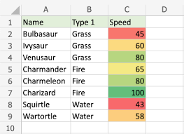
VLOOKUP EXAMPLE:

There are a couple of major shortcomings in using VLookup function of Excel. First of all, the VLOOKUP is really a slow function. It is apparent when you do a lookup on a large list of 100,000 values or more. Secondly, VLOOKUP can only look up up a corresponding value from the columns on the right of the looked-up value. It can’t look to the left!

Make sure you master this Excel function really well.

HLOOKUP Function in Excel

An oft-forgotten cousin of VLOOKUP, this Horizontal Lookup and Reference function in Excel works in a similar way too. The only difference is that in this case, a lookup dictionary is a horizontal dictionary of columns, denoted by the H.

HLOOKUP is most used in range lookups, rather than exact matches, as columns are not the best suited for exact values, because of their limit of 16,000. Where a list can grow vertically to over a million records easily.

In the following formula, this lookup function searches for the closest match, especially when we are not searching for an exact match, but an approximate match. The dictionary is the table array and it is recommended that we use the absolute reference to lock the cells from moving.

=HLOOKUP(A5, $G$2:$K$100, 2)

Here the HLOOKUP will search for the exact or the next smallest value in the lookup table absolute range of $G$2 to $K$100, and return the second row. If you want the third row, you can change the 2 into a 3.

Both VLOOKUP & HLOOKUP return values from a single row or a single column.

Using the XLOOKUP Function in Excel

Did you know that new functions are added to Excel till today, and these are extremely useful functions making approximate matches as well as exact matches.

Finally, after years of backlash at Microsoft for creating the mess with the Match Type (True and False) in VLOOKUP, they got rid of it completely in the Excel XLOOKUP function.

And by default, XLOOKUP is set to do an exact match.

XLOOKUP requires a deeper understanding of the various scenarios. I’d recommend attending our formal ADvanced Excel Training to build a strong foundation in Excel. You can call us at 6250-3575 for more information of our courses and available enrollment dates for classroom training in Singapore.

This new XLOOKUP function of Excel is only available from Microsoft Office 365 users. It does not work on Excel 2016 or Excel 2019 versions.

Using INDEX Function in Excel

If you know the row number, you can find the value on that row or column cell directly.

INDEX can be used as an Array function also. Paired with MATCH, you can find any value on any row or column in a 2-dimensional array.

Index can help you to find the value on the row or the column of the specified number

How To Use Excel MATCH Function

When you want to find an exact match in an array and return the row number in the array, MATCH comes to your rescue. It is one up on VLOOKUP, which requires you to know the column you want to return. MATCH can find a match for a value that is lower, exactly equal or higher than the specified value.

Paired with INDEX, an INDEX & MATCH Function can manage to look up on the left or the right of any array of cells.

Master the OFFSET Function within Excel

To navigate your way in a two-dimensional array of rows and columns, you can use the OFFSET function in Excel. It can traverse any number of Rows or Columns, and get you the value.

How to use the offset function in Excel:

=OFFSET(Starting Cell, Row to move up or down, Columns to move left or right, Number of rows required to be returned, number of columns required to be returned)

I generally use OFFSET more than INDEX and MATCH combinations. Using one super-powerful OFFSET function is more straightforward.

Once you start using Offset in Excel, you wouldn’t want to use other lookup functions of Excel.

When Do I Use the INDIRECT Function of Excel?

The Excel INDIRECT function returns the reference specified by a text string. References are immediately evaluated to display their contents.

Use the INDIRECT function when you want to change the reference to a cell within a formula, without changing the formula itself.

=INDIRECT(A3)

The above Indirect function will check what is in cell A3. And A3 will have the cell reference to another cell. So if A3 contains B35, Excel will then read the value in cell B35.

Thus, we can get the value of the reference in cell A3. The reference is to cell B3, which may contain the value 45.

The INDIRECT can be very useful in creating custom management dashboards and reports.

What does the FORMULATEXT Function of Excel Do?

Displays the text of another formula. This helps to see all formulas next to their values and can be useful to spot mistakes and issues with formulas.

=FORMULATEXT(A3) will provide you with the formula in cell A3 as a Text Value.

This FormulaText function is useful to see the formula without having to go into Editing mode.

View this link for more information on how to get the Formula of another cell in Excel.

How to use ROWS Function of Excel

Displays the row number of a reference cell.

=ROWS(A1:B4)

Will return a 4. This is because there are 4 Rows in the given range.

How to Use the COLS Function in Microsoft Excel?

Displays the column number of a reference cell.

=COLS(A1:B4)

Will return a 2. This is because there are 2 Columns in the given range: A & B

Using the TRANSPOSE Function of Excel like a Pro

Converts rows into columns and columns into rows. Just like the Transpose feature in Paste Special, but done programmatically.

So if you use TRANSPOSE(A1:D3), you have selected 4 columns and 3 rows.

After the Transpose is completed, you will get an array reference of 3 Columns, and 4 Rows. The horizontal table would have flipped and will be visible vertically.

Pretty nice use of hanging values in rows into columns.

When Do I Use the UNIQUE Function of Excel?

The UNIQUE function of Excel generates a list of unique values that automatically spill down. An array function can be used to create data validation lists too. Available from Microsoft Office 365 onwards. This UNIQUE function is not available in Excel 2016 or Excel 2019.

Learning the Lookup Functions in Excel Quickly & Easily

As you can see, there are a lot of LOOKUP functions in Excel, and learning and mastering them takes time. But once you do master them, you can do wonders with your Excel skills.

It is worth the effort to learn the Excel Lookup Functions. Call Intellisoft at 6250-3575 or What’s App at +65 9066 9991 for Excel 365 Training that covers the key Lookup functions of Excel.

You will definitely enjoy it!

Cheers,

Vinai

Founder & Master Trainer at Intellisoft Systems in Singapore.
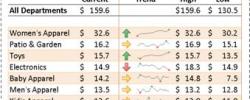
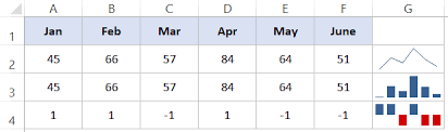
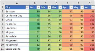
Free Tips, Tutorials & Training Grants Info

Learn from expert tips, tricks and resources for Excel, PowerPoint, Photoshop, Python, Power BI, Project Management, IT, Soft Skills & more with our Email Newsletter.
Plus get the latest news on Grants. Join Today!

Found What You Were
Looking For?

Just Tell us...

We're Here To Help You!