In Microsoft Excel, some of the new features are sparklines and slicers, and improvements to PivotTables and other existing features, can help us to discover patterns or trends in the data. To get started with the features of Excel, first we will look at the details of the Sparklines and slicers features of Excel.
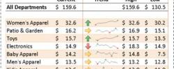
Sparklines are tiny charts that is used to fit in a cell to visually summarize trends beside the data.
Since sparklines show trends occupies less space, they are exclusively useful for dashboards and other places where we need to show a glimpse of the business in an simple practical visual format.
In the image to the left, the sparklines that appear in the Trend column lets us have a quick look of the performance of each department in the month of May.
Slicers
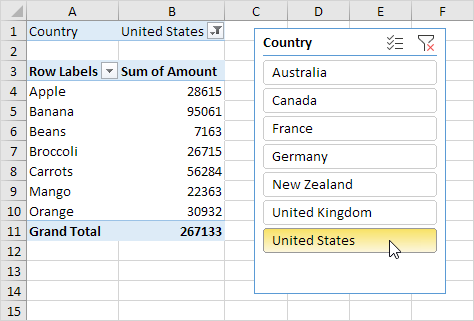
Excel Slicers Sample
Slicers are visual controls. They let us quickly refine data in a PivotTable in an interactive, automatic manner. If we insert a slicer, we can use buttons to quickly segment and refine the data to display appropriate results.
Not only that, when we apply more than one filter to the PivotTable, we no longer have to open a list to see which filters are enforced to the data. Rather, it is displayed on the screen in the slicer.
We can make slicers relate to the workbook formatting and easily reuse them in other PivotTables & PivotCharts.
He has conducted over 700 live workshops, and trained over 5,000 students in over 18 countries, and regularly conducts Excel Workshops in Singapore, Malaysia, Indonesia, Australia, India, Dubai, Egypt, Zimbabwe, South Africa etc.
Using GetPivotData in Excel To Get Pivot Values Instantly
Pivot tables from Microsoft are a great boon in Excel. Previously, getting IT departments to write custom reports used to take ages. And even if you could get a report written for your needs, by the time you got it, it was too late, or you wanted to look at information from another angle.
With Pivot tables, you can now create your own reports in no time. And you can slice and dice information pretty easily, with just a few clicks. If you haven’t used Pivots, this is a great reason to go for Advanced Excel Training.
However, even though Pivot tables are great, they are not the best tool for presenting information for the senior management. There may be times when you want to pick up certain information from the pivot table, format it nicely, and present it with other summary figures.
To use the summarized data from the pivot table, but make it more presentable, you can use an extremely useful function of Excel called the GetPivotData.
Enabling GetPivotData Button
It is very easy to get this function to work. This little gem is hidden right within the Pivot Toolbar. Just right click on the Pivot Toolbar, right at the end, and select customize. Pick Add/Remove Buttons.
Select GetPivotData button. This is a toggle button – click it once and it gets enabled, and another click disables it. You can see a slight change in the icon when it is enabled or disabled.
Once the button is highlighted, you can begin writing your formula. Start with a = sign in a black cell where you want a pivot table value. then point to any cell in the Pivot Table. Its value is captured in your formula.
As long as the data is available and visible in the Pivot table, you can move the data around from rows to columns or page fields, but it will still appear correctly in the presentation area.
Go ahead. Give it a try and make your data presentation summaries more dynamic and presentable. Any questions or comments, do let me know.
I bet you know how to sort data in Excel. It is pretty easy. Most of the time an ascending sorting is what we need – letters and numbers listed in the ascending order – a to z, 1 to 100 etc. And just in case you need to sort in the reverse order, you have the Z to A sort, also called the Sort in Descending order. Between the two, most people are quite happy, thanks to Microsoft‘s intuitive sorting options.
However, there arises a time when you don’t want either the sort in Ascending order or the Descending order in Excel.
Examples where a Standard Sorting won’t work:
For example, if the departments in your organization are Finance, Marketing, Sales & Engineering. And you want the Sales department to be listed first, followed by Marketing, Engineering, and Finance being the last.
Now how would you sort the departments in this order? Ascending or descending sort is not going to work.
Do not despair however. Here is where the power of Microsoft Excel Custom sort shines.
Another scenario is the Sorting of Months – say you want to sort April, May & June, in this order. Or maybe you want to sort regions by East, West, North & South. This EWNS order also needs a custom sorting in Excel.
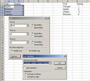
Or if you have a completely random order – which defies any kind of sorting. Say you want to list Oranges, then Apples, then Grapes, and finally Bananas. You can go nuts without custom sorting criteria in Excel.
Using Custom Sort in Excel
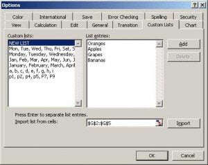
First, let’s create the custom list in Excel.
Go to Tools, Options, Custom Lists.
You can key in your list and click Add. Or you can import your list from another area of the spreadsheet, where you list the options in the sorted order.
Once you have imported the list in the correct order, you can go to Data, Sort, and then click on Options at the bottom of this popup window.
Choose your custom sorted list from the list of First Key Sort Order.
Voila! Your list is now sorted in your very own custom order.
Alternatives to Custom Sort in Excel
Of course, if you don’t want to use Custom Sort, there are other alternatives. I have often used a Lookup Table
Fruit Sorting
Oranges 1
Apples 2
Grapes 3
Bananas 4
I then use the inbuilt Lookup function of Excel called VLOOKUP function and pick the correct value, and then do an Ascending sort. This is a quick cheat trick.
Most people take Excel to be a number crunching tool… boring and unattractive.
Actually, Microsoft Excel has been slowly transforming… adding more and more features that make presentation of number much better with every new edition of Excel.
The Excel 2016, 2019 & Microsoft Office 365 versions are extremely powerful and you can create dynamic dashboards with buttons, check boxes, drop downs, scroll bars, conditional formatting, pivot charts, slicers, and a host of other features, just by using Excel.
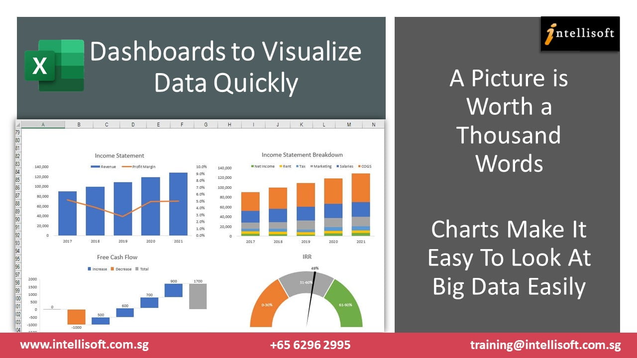
What is an Excel Dashboard?
An Excel Dashboard is a simple tool for the management, allowing them to get a glance at the business in just a single screen – without looking at multiple sheets of data or charts.
See the dashboard created in the image here. You may not even realize that it was created in Microsoft Excel.
Plus, it is not just a pretty dashboard. There are things that can change – with the click of a button, you can change the division, product, year, and the entire set of graphs, numbers, charts will change dynamically. Try that in PowerPoint….
Is Excel Good for Creating Dashboards?
Yes, Excel has all the important features that can make a complete dashboard. In fact, small companies rely on Excel for almost all their work as they can’t afford the more expensive Business Intelligence software. You can create multiple charts, KPIs, to be displayed in a single page, and set them to refresh automatically upon opening.
There are several options to add buttons, dropdowns, check boxes, radio buttons that add interactivity to Excel dashboards. With these control, plus macros, and Power Query running in the background to fetch and clean data, is all you need to make any kind of dashboard in Excel.
How to Create a Dashboard in Excel from Scratch?
It is pretty easy to make a Dashboard in Microsoft Excel. Here are some steps for you to follow:
How To Create a Dashboard in Excel
Step 1: To make a dashboard in Excel, you must begin with the end picture in mind.
If you do not have a clear end picture in mind, it may make sense to do some brainstorming on a piece of paper.
Better still, gather a bunch of colleagues and managers, and do this in a meeting, to understand what are the key things you must measure. KPI, ROI, Net Margin, Market Share, Cost per acquisition etc. are good things to measure. This can be translated into any industry. So you can measure Number of hotel nights booked, Number of patients admitted vs discharged, average hours worked per week etc.
You also have to think about the Dimensions you would like to slice this data on – by Country Department, Quarter, Zone, Area, Cost Center, etc. This will allow you to compare the metrics from the different periods and it becomes much easier to track if the performance is getting better or worse.
Step 2: Collect the Required Data For the Excel Dashboard
Once you know what you want to track and measure, you must make sure that this data is collected, and is available. You might have to extract it from your ERP or internal databases or systems.
Microsoft Excel can load any kind of data – be it text file, CSV file, directly scrape off the data from the Internet, or even read it from a SQL RDBMS database.
Step 3: Clean the Data
Extract & take the required data. You will have to clean it using Excel Formulas and functions, or you can use Power Query. Remove useless columns.
Use of functions like these can be handy
FILTER
CONCATENATE
LEN
PROPER
DATEDIFF
TODAY
NOW
LEFT
RIGHT
FIND
Step 4: Build Connections With Master Data
Raw data on its own may not be very useful. Build the right VLookups to link with Master Data for our Dashboard Creation in Excel.
You can link Excel to other external or internal workbooks, and worksheets. You must know how to copy or link data from external worksheets and workbooks.
The good thing is that once the connection is built, you don’t have to open the associated file to use it.
Excel will automatically open the linked files when the management dashboard is being refreshed.
Step 5: Build Measures & Calculations For the Excel Dashboard
A few new formulas may be required to be built, to calculate the key measures. This requires knowledge of advanced excel formulas like the ones here. You may need more or less….
Starting out with these key Advanced Excel Functions is going to be crucial for a good Excel Dashboard.
VLOOKUP or XLOOKUP
INDEX,
MATCH,
OFFSET,
SUMIF,
LARGE
SUBTOTAL
FILTER
Step 6: Build Charts & Tables With the KPIs in the Excel Dashboard
The next step is to start building the dashboards with the KPIs, Charts, Pivots to summarize the data at the right granularity.
Excel dashboard training in Singapore by Intellisoft – Vinai Prakash
You can add pivot tables, Excel Tables, Charts, and Summary Calculations. You can also use Conditional Formatting for these values, to be able to pin point them easily. Once the Dashboard looks great, you move to the next step in Excel Dashboard creation, where interactivity is added.
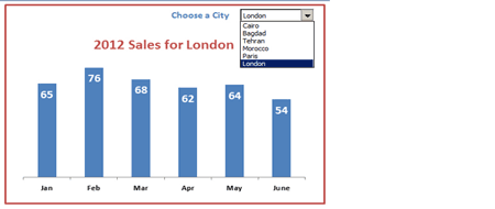
Step 7: Add Interactivity With Excel Controls
Once the KPIs are in place, it is required for your to build the interactivity in, to slice and dice by country, division, zone, periods like quarters, months etc. You can add Slicers, Buttons, Dropdowns, Check boxes to check or uncheck, and based on the selection, the appropriate charts and KPIs can be updated.
Step 8: Begin Using The New Dashboard
That’s it. Your Excel dashboard is ready. Begin using it. Tweak it as needed. Share it with other colleagues, so you can gather more feedback, and improve it. Once a dashboard becomes ready, it becomes easy to measure things throughout the company, based on the same benchmark or metrics.
Excel Dashboard Training Participants at Intellisoft
You can attend our 2 day Most Popular Excel Dashboards Training in Singapore – it starts at the basics, and covers step by step features required to create such dashboards with Excel, on your own.
Plus we provide you with snacks, tea/coffee breaks, so everything required is available… and you can focus on learning and building the Excel dashboards quickly, and easily.
Intellisoft runs Dashboard MasterClass in Singapore, Malaysia, Indonesia, Hong Kong, Dubai, Qatar, India, and many other countries.
If you would like to join our next Excel Dashboard Training Course, simply contact us, and we will advice you of the dates, training schedule in the city of your choice.
Contact us to enroll for this practical, hands on training. We will email you the Course Brochure too, so you can see the topics covered in detail.
Customized Corporate Training is available for this Excel Dashboard Training in Singapore
So far we have conducted a number of such classes for the staff of large MNC companies, teaching them how to create such reports and dashboards with ease, and they have been highly popular and successful… requiring us to do multiple repeat sessions for other divisions, countries also.
Do learn these simple techniques to create useful, and interactive Dashboards using Excel and beyond. You will be amazed at the ease with which you can track and measure things. Better still, everyone will be on the same page.
Removing confusion from the corporate culture is a major step towards success with Excel Dashboards
Cheers,
Vinai Prakash
Intellisoft Systems Team
Singapore
Practical hands-on advanced excel training at Intellisoft
Most people hardly use the huge number of features available in Microsoft Excel. Many are just using Excel as a calculator. This is a gross under use of Excel’s vast potential and feature rich functionality.
Do a quick check, and see if you use these advanced features of Microsoft Excel in your day to day work.
Some of the common things that can be done easily with Excel are:
Finding the Top 10 Customers or Finding the Bottom 10 Performers in the organization
Highlight values that are above or below a certain threshold – like all sales above $25,000 to be highlighted
Sort the values in Ascending, Descending or any customized order – like sorting in order of Manufacturing, Accounts, Sales departments.
Give Names to Range of Cells, and then use them in formulas for easy referencing and decoding
Exploit Pivot Tables to Summarize the data and slice & dice it in any way – finding sales by product groups, or calculating productivity by department
Write Macros to automate routine things that save you a huge amount of time – example creating pivots, charts, tables, and doing complex calculations automatically.
Use advanced filtering conditions, and be able to filter data using multiple different criteria
Create fantastic charts that portray the given business situation perfectly. There are over 50 different types of charts to choose from, and each has its edge, advantages and a reason.
Create management dashboard that are dynamic, and provide a complete snapshot of the key business KPIs in the company – change the chart values at the click of a checkbox or change in a drop-down value
Use Excel’s advanced What-If analysis to do projections for future, forecasting, trend analysis etc. with ease
Use Lookup tables to find any value or corresponding value from a table using advanced functions and formulas
This is just the tip of the iceberg. Microsoft Excel is really extremely powerful. Each version of Microsoft Excel – be it Excel 2007, or Excel 2010 or Excel 2013 adds more and more features to the already powerful dynamite of a package.
So what are you waiting for? If you would like to learn any one or more of such useful features of Microsoft Excel, come for a short Excel Training at Intellisoft.
Go ahead, equip your team with the right skills. Get everyone on board to learn the basic and advanced features of Microsoft Excel, and Be Awesome in Excel!
Email to training@intellisoft.com.sg or call +65-6250-3575 for the next available schedule of Microsoft Excel Training in Singapore.
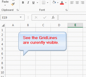
Make a nice report in Excel. Then print it. You’ll be disappointed. Because the gridlines that are visible in Excel, that make the rows and columns visible, don’t get printed by default when you print any Microsoft Excel file.
It is much easier to type in Excel when you can see the grid lines to demark rows & columns. However if you print your beautiful Excel file, it may not seem so easy to read, because the lines that separate the rows and columns are not printed by default.
You may miss the row/column alignment and misread the wrong data with the wrong row… specially when there’s a lot of data on a page, and the fonts are a bit small.
That’s when printed gridlines in Excel reports come in handy.
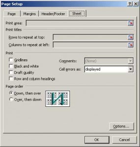
Gridlines in Page setupPage setup
Now there has always been a way to get the grid lines to print, since Excel 2000, and it is still available in Microsoft Excel 2016, 2019 or Office 365, in the same place. In Excel , you have many ways to get to the Print Grid lines option.
Go to Print > Print Preview & Click on Page Setup. The option to print gridlines in Excel is hidden here.
You will see a popup box come up. Click on the 4th tab and select Sheet. You should see something like this screen shot below.
Gridlines in Print Preview
As you can see, there is a checkbox which says – Gridlines in the Print section. Select the Checkbox, and then click OK.
You will see tiny gridlines appear on the screen. Now when you print the sheet, you will see gridlines being printed, and it is much easier to view the figures on the printed sheet with gridlines printed.
Learn from expert tips, tricks and resources for Excel, PowerPoint, Photoshop, Python, Power BI, Project Management, IT, Soft Skills & more with our Email Newsletter. Plus get the latest news on Grants. Join Today!