Microsoft Excel is one of the most used software at work. People who claim to know Microsoft Excel software mostly are the ones with basic or intermediate knowledge & understanding of Excel. The productivity increases only when we make the most out of the useful software, and gain mastery.
There are many hidden gems and short cuts within Excel, that hardly anyone talks about. I am amazed when people with years of Excel experience tell me they haven’t heard about these. What a waste of time…
‘Let us discuss in this series the ultimate tips in Excel that will make things snappier, and make your co-workers say, “how did you do that??”. They will save a lot of time for you too and improve your productivity.
Tip Number 01 INSERT SERIAL NUMBERS IN A FLASH
What do we when we have to insert Serial Numbers in Excel? We type the number 1 in the cell A1, then 2 in the cell A2, and finally select both the cells & drag the mouse pointer until we get the required serial numbers generated. Right?
But what happens when we need Serial numbers until 100? 200? Or more?
Do we keep dragging? Certainly not!
There is an ultimately easy way in which you can just flash fill the serial numbers to whatever value needed.
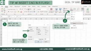
Here are the steps:
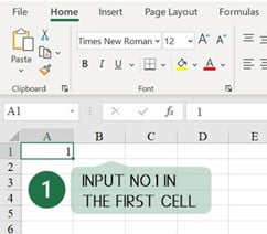
Input Number 1 in the first cell
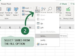
Select Fill > Series from Editing Ribbon of Home Tab
- Home> Fill > Series
- Select Columns from the Dialog box, give Step & Stop values and Hit OK.
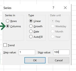
NOTE: If you are looking to Fill Rows instead of columns, just select Rows in the dialog box and follow the same steps.
Bet you didn’t know this trick… Well, now you do.
Tip Number 2 FORGET COPY+PASTE – JUST DRAG & DROP
When we have a set of data in one column & we want it to move to another column. What do we do? Select them all, copy or Hit CTRL C and select the destination column, and paste or hit CTRL V?
Forget the hassle, now select the required data, just Drag & drop to the destination.
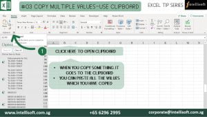
Tip Number 3: COPY MULTIPLE VALUES USING THE CLIPBOARD
Working with multiple values? Forget the hassle of copying and pasting one by one.
Use the built in Clipboard feature of Excel.
You can expand the clipboard from the icon lists or use the Win (Windows Key) + V to click on the required values
Tip Number 4: DUPLICATE A SHEET IN JUST ONE-CLICK
Want to copy the whole sheet? Are you selecting and copy pasting?
Or right click, copy, select the sheet, move to bottom?? So many steps for duplicating the sheet?
Now Duplicate a Sheet like a Pro!
Just hold down Ctrl + Drag & Drop the sheet to desired position.

Tip Number 5: UNDO & REDO IN ONE HIT
Undo & Redo would be the most used operations in Excel.
Now do undo and redo with just one click.
Use the buttons on top.

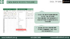
Tip Number 6 Use the QUICK ACCESS TOOLBAR
Tedious to find the operations that you frequently use?
CHANGE ALL CAPS TO Mixed Case for Next 3 Rows.
CLICK THE DROP DOWN ARROW TO SEE THE OPTIONS
YOU CAN ADD THE FREQUENTLY USED OPTION TO QUICK ACCESS TOOLBAR
EXTRA TIP: YOU CAN ADD ANY OTHER COMMANDS THAT YOU USE FREQUENTLY
Hope that helps! Want to learn more exciting tips, tricks & shortcuts and improve your productivity in Microsoft Excel?
If you wish to build your knowledge to have a better Excel Operations knowledge, you must start working on it. You will do well in your career, and get ahead faster, even land that dream job with better skills & competence in Excel.
We at Intellisoft are here to guide you.
Intellisoft Systems offers 2 day extensive workshops on Microsoft Excel.
Simply pick a program – Basic/Intermediate Excel OR Advanced Microsoft Excel
Join us to get more out of Microsoft Excel to make the best use of the software in your day-to-day work!