In Microsoft Excel, some of the new features introduced in the past 15 years are amazing for every day use. Spark lines and Slicers are some of these amazing gems of Excel.
Learn sparklines, charts, and infographics in our Advanced Excel Courses Singapore SkillsFuture.
These improvements to PivotTables and other existing features, can help us to discover patterns or trends in the data. To get started with the features of Excel, first we will look at the details of the Sparkline and slicers features of Excel.
What are Spark lines in Excel, and How to Use Them

Sparklines are tiny charts that is used to fit in a cell to visually summarize trends beside the data.
Sparklines are an extremely useful and user friendly feature in Microsoft Excel that allow you to create small, visual representations of data trends within individual cells.
These tiny charts provide a compact way to display trends, variations, and patterns in your data without taking up a lot of space. Sparklines are particularly useful when you want to quickly analyze data at a glance or within a confined area, such as a cell or a small column.
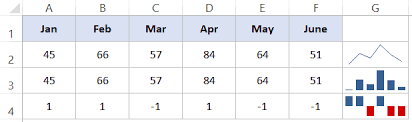
There are three main types of sparklines in Excel:
- Line Sparklines: Line sparklines show trends over a period of time. They are typically used to display data points in a line chart format, helping you visualize trends, fluctuations, and patterns over time.
- Column Sparklines: Column sparklines are used to compare values among different data points. They can help you identify variations and relative sizes of data within a specific context.
- Win/Loss Sparklines: Win/loss sparklines are used to represent binary data, often indicating “win” or “loss” scenarios. These are typically shown using icons or symbols to denote positive or negative outcomes.
Since sparklines show trends occupies less space, they are exclusively useful for dashboards and other places where we need to show a glimpse of the business in an simple practical visual format.
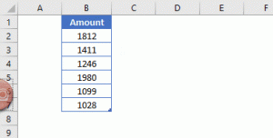
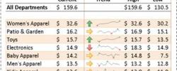
In the image to the left, the sparklines that appear in the Trend column lets us have a quick look of the performance of each department in the month of May.
If you want to join our Excel course in Singapore & improve your skills, we have multiple courses – Basic Excel for Analytics, Advanced Excel Courses in Singapore & VBA Macro Programming Courses.
Key features and benefits of Spark Lines in Excel include:
- Compact Representation: Sparklines are designed to fit within individual cells, making them an efficient way to provide data insights in a constrained space.
- Visual Analysis: By using simple visual cues, sparklines allow you to quickly identify trends and patterns, even without delving into detailed data analysis.
- Easy to Create: Creating sparklines in Excel is straightforward. You can insert sparklines through the “Sparkline Tools” tab on the Excel ribbon after selecting the data range you want to visualize.
- Dynamic Updates: Sparklines are dynamic, meaning they update automatically when you change the data or adjust the range they’re based on.
- Conditional Formatting: You can apply conditional formatting to sparklines, enhancing their visual impact. For example, you can color-code sparklines based on specific conditions, making trends more apparent.
- Compatibility: Sparklines are available in most modern versions of Excel, including Excel 2010 and later.
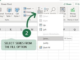
To Create Spark lines in Excel:
- Select the cell where you want the sparkline to appear.
- Go to the “Insert” tab on the Excel ribbon.
- In the “Sparklines” group, choose the type of sparkline you want (Line, Column, or Win/Loss).
- Select the data range you want to visualize.
- Click “OK,” and the sparkline will be generated within the selected cell.
Remember that while sparklines provide a quick and visual overview of data trends, they might not replace the depth of analysis that larger charts or graphs can offer. Use sparklines in scenarios where space is limited and you need to provide a concise snapshot of data trends.
When and where is the best use of Excel sparklines
- Dashboards and Reports: Sparklines are ideal for creating dashboards and reports that require a compact presentation of key performance indicators (KPIs) and trends. You can include multiple sparklines in a small area to provide an overview of various metrics.
- Tables and Data Lists: When working with data tables or lists, you can add sparklines next to numeric data to provide context and visual insight into how values are changing over time or between categories.
- Financial Data: Use sparklines to visualize changes in financial data, such as stock prices, revenue, expenses, or budget allocations. Line sparklines can help show trends over time, while column sparklines can highlight variations between categories.
- Project Management: Incorporate sparklines in project management to illustrate task completion, project progress, or resource allocation. For instance, you can display task completion rates using win/loss sparklines.
- Sales and Marketing: Use sparklines to represent sales figures, conversion rates, or website traffic data. These visualizations can help sales and marketing teams quickly assess performance.
- Comparative Analysis: When comparing data sets or categories, column sparklines can show relative values and trends, making it easy to identify patterns and outliers.
- Scorecards: In performance scorecards or performance reviews, sparklines can visually summarize an individual’s progress or achievement over time.
- Educational Purposes: Sparklines can be used in educational materials to help students understand data trends and patterns, making learning about data analysis more engaging.
- Emails and Presentations: Incorporate sparklines in emails or presentations to provide a quick visual representation of data trends without overwhelming the audience with extensive charts.
- Data Visualization in Cells: In spreadsheets where you need to keep the data and visualizations together, sparklines offer a convenient way to incorporate visual insights directly into the data cells.
While sparklines are excellent for providing quick insights, they might not replace the need for more detailed charts and graphs in situations where deeper analysis is required.
Additionally, when using sparklines, it’s essential to ensure that the data you’re visualizing is appropriate for the type of sparkline you’re using (line, column, or win/loss) to ensure accurate representation.
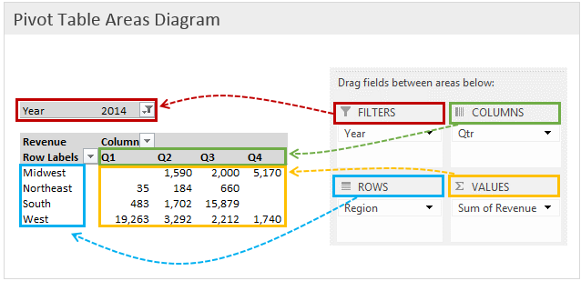
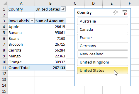
What are Slicers in Microsoft Excel
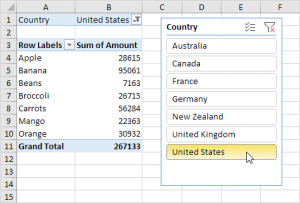
Slicers are visual controls. They let us quickly refine data in a PivotTable in an interactive, automatic manner. If we insert a slicer, we can use buttons to quickly segment and refine the data to display appropriate results.
Not only that, when we apply more than one filter to the PivotTable, we no longer have to open a list to see which filters are enforced to the data. Rather, it is displayed on the screen in the slicer.
We can make slicers relate to the workbook formatting and easily reuse them in other PivotTables & PivotCharts.
Slicers provide an intuitive and user-friendly way to filter and analyze data without the need to access complex filter menus or dialogs.
Slicers create buttons or visual elements that you can click or select to filter data, making data analysis more dynamic and accessible.
When you insert a slicer into an Excel workbook, it creates a dashboard-like interface where users can easily filter data by clicking on specific elements. Slicers are especially useful for large datasets and complex reports where traditional filtering methods might be cumbersome.
When to Use Slicers in Excel:
- Pivot Tables and Pivot Charts: Slicers are primarily designed to work with pivot tables and pivot charts. They enhance the usability of these tools by providing a simple way to filter and slice data dynamically.
- Large Datasets: When dealing with large datasets, using traditional filter dropdowns can be overwhelming. Slicers offer a more user-friendly experience by visually representing filtering options.
- Interactive Dashboards: If you’re creating interactive dashboards or reports, slicers can be a great addition. Users can quickly filter data to focus on specific aspects of the report.
- Data Exploration: When you want to explore data trends and patterns quickly, slicers allow you to filter data on the fly without the need to constantly modify filter settings.
- Collaborative Work: Slicers are particularly useful in collaborative environments where multiple users need to analyze data. They provide a consistent and easy-to-understand filtering interface.
- Sales and Marketing Analysis: Slicers are beneficial for sales and marketing reports where you want to analyze data by different criteria such as time periods, regions, products, or customer segments.
- Comparative Analysis: Slicers can be used to compare data across different categories, allowing you to instantly switch between various data subsets for comparison.
- Data Visualization: When creating presentations or reports for non-Excel users, slicers provide a more intuitive way to interact with and explore data.
How to Use Slicers in Excel:
- Create a Pivot Table or Pivot Chart: Before adding slicers, you need to create a pivot table or pivot chart based on your data.
- Insert Slicer: Go to the “PivotTable Analyze” or “Analyzing” tab on the Excel ribbon, then click on the “Insert Slicer” button. Choose the fields you want to use as slicers.
- Arrange Slicers: Once inserted, arrange the slicers on your worksheet as needed. You can resize them, move them around, and align them to create an organized layout.
- Filter Data: When you interact with a slicer by clicking on an element (e.g., selecting a specific category or time period), the associated pivot table or pivot chart will instantly update to show the filtered data.
- Multiple Slicers: You can insert multiple slicers based on different fields to provide more comprehensive filtering options.
Remember that while slicers are a fantastic tool for interactivity and data analysis, they are best suited for scenarios involving pivot tables and pivot charts. For traditional data tables, you might want to stick with standard filtering options.
 If you would like to learn more about these new features of Microsoft Excel, or would like to attend the Advanced Microsoft Excel Training, do contact us at Intellisoft Systems.
If you have any further questions or want to join a training on how to use Sparklines, contact Intellisoft for Corporate Training on Excel or call at +65 6250-3575.
Trainer: We have certified trainers who excel in imparting their knowledge and are very patient. Master Trainer Vinai teaches Advanced Excel Techniques, Dashboard Techniques using Excel, Advanced Data Analytics & Data Visualization Training courses at Intellisoft.
Vinai has trained over 15,000 students in over 18 countries, and regularly conducts Excel Workshops in Singapore, Malaysia, Indonesia, Australia, India, Dubai, Egypt, Zimbabwe, South Africa etc.
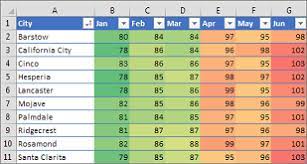
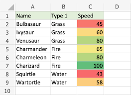 Conditional formatting makes it easy to emphasize important cells or ranges of cells, highlight unusual values, and visualize data by using data bars, color scales, and icon sets. In each newer version of Excel, it includes further more formatting flexibility. Conditional formatting is one module in our