Want to go beyond the common use of Excel and Explore its Extremely Useful but Lesser-Known Features of Microsoft Excel?
Microsoft Excel’s extensive features can help you to increases productivity and also saves time. Become proficient in Data Management & Business Analytics – Turn Data into Insights, Develop better tables & charts.
Lesser Known Features of Microsoft Excel
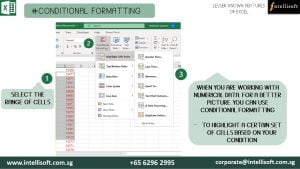
Conditional Formatting:
Apply formatting to cells automatically depending on the value of the cell. It is also a powerful feature, given that conditions can be based on any Excel formula. Conditional Formatting works by letting you set rules for how cells can be customized.
Conditional formatting makes it easy to highlight required cells or ranges of cells, emphasizing unusual values. In addition to that, it is used to visualize & analyze data in Excel by using data bars, color scales, and icon sets. Overall, it helps you to identify important data faster.
Learn Lesser Known Shortcuts of Excel at Intellisoft Singapore
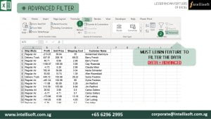
Advanced Filters:
This Advanced command works differently from the Filter command in several ways. It displays the Advanced Filter dialogue box instead of the Auto Filter menu. You can filter the data in place, or to a different location. You can also specify that you want to see unique items only.
All the duplicates are removed from the filtered list, with Advanced filter. The Data tab contains all the features of Advanced Filters. The advantage of using advanced filter is that you can see the filtered criteria in Excel cells. You can also easily add new filters by typing the values directly in the cells. Thus, it is absolute must learn feature.
Learn Advanced Filter for more Productivity at Intellisoft Singapore
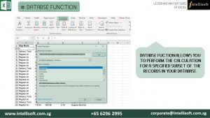
Database Functions:
Database functions is a Seldom used Gem in Microsoft Excel. With this, you can not only perform basic calculations but also use complex criteria, that allow you to perform the calculation for a specified subset of the records in your database.
These functions treat the entire set as a Database, just like a SQL Database.
Learn the Database Function at Intellisoft Singapore
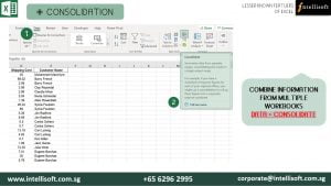
Consolidating Multiple Worksheet:
If you receive information in multiple sheets or workbooks that you want to summarize, the Consolidate command can help you pull data together onto one sheet. It allows you to combine information from multiple workbooks when you need them one place.
The Excel consolidate function lets you select data from its various locations and creates a table to summarize the information for you, automatically, painlessly.
Learn Consolidate Function at Intellisoft Singapore
Preventing others from Changing Master Data:
This feature allows you to prevent other users from accidentally or deliberately changing, moving, or deleting data in a worksheet. You can lock the cells on your Excel worksheet & then protect the sheet with a password.
With worksheet protection, you can make only certain parts of the sheet editable and users will not be able to modify data in any other region in the sheet.
You can lock the structure of your workbook by specifying a password.
Locking the workbook structure prevents other users from adding, moving, deleting, hiding, and renaming worksheets.
Do you analyze data? Whether you work in Sales, Finance, Manufacturing, Logistics, Engineering or Customer Service, there is a constant need to analyze data.
With the advent of the industrial age and the conveyor belt, gaining efficiency and reducing errors has been a constant battle. We need more and better ways to analyze data. Today, billions of new data points are gathered every minute. There is more storage available in the cloud, and there is no dearth of computers big and strong enough to process it quickly.
Yet, there is a lack of know how, a lack of understanding on how to analyze data. As a result, more companies are still not able to tap on the promise of Big Data, Artificial Intelligence, Internet of Things or Machine Learning.
To Understand the State of Data Analysis, and look at solutions, we need to understand a few fundamentals about Data, and Data Analysis.
Why Do We Want To Analyze Data?
Duh!
Of course there are a gazillion reasons.
No… Not really. The need to analyze data is routed in only a few basic reasons.
To Gain Insights about our data. Why?
So that we can find out what works, and what does not. So we can compare the past results with another company, another product, another period, and see if there is some insight to glean.
When we find out what works, and find out where the problem lies, we can then perform Root cause analysis – which can tell us the real problem to fix. When we have fever, we can take a tablet of Paracetamol (Tylenol/Panadol/Aspirin).However, the fever is not the disease. It is a symptom that we develop, when something is not right with our body, and the body is fighting the bad bacteria/virus. During this fight, the temperature rises. The Paracetamol can reduce the fever, but it does not remove the fight.
To go to the root cause of the problem, a visit to the doctor is required. The doctor may analyze the problem by looking at your Blood pressure, heart rate, x-ray, probes etc. and figure out the issue. If it is indeed bad bacteria causing some area to swell, the doc can issue a dose of Anti-biotics, which fight the bad guys, and treat the real problem.
Once the bad guys are gone, the fever automatically comes down to the normal level.
Make Better & Faster Decisions
Based on the insights, we are able to make better decision, and faster too. And backed by data, we can have more confidence on our decision making process… rather than relying only on the gut-feeling.
With statistical methods of analyzing data and forecasting trends, the accuracy of the analysis, and insights gets deeper as we generate better analytics. We can then make a more informed decisions faster.
How Do We Analyze Data: The Traditional Data Analysis Process
The data analysis process is simple, and we have been following it for so long that it has almost become a habit… albeit a not so good habit. What we usually do is outlined below:
Get the Raw Data File From The Source System
This could be a Text File, a Comma Separated Values (CSV) File, a PDF file, an SQL data dump, an Access or RDBMS source (think Oracle, Microsoft SQL Server or MySQL Database)
Load into Excel
Load this data into Excel. This could be easily achieved, but this is a manual process, that has to be repeated every day, week, month etc., whenever the data changes, or new data arrives.
Clean
Incoming data is seldom clean. There will be missing values, duplicates, wrong headers, mis-aligned dates in YYYYMMDD or some other odd text or numeric layout, and other data issues to fix.
To do this, you’ll have to write some simple formulas, functions, data cleanup steps, fix dates, and fill blanks or nulls with an appropriate values. This is all manual process, unless automated with the help of macros.
Lookup Master Data
Once the data is cleaned-up, we need to change the codes with values, get the correct product price, employee salary, or the date of manufacture from some master data tables. This often requires expertise with Excel formulas like VLOOKUP & HLOOKUP.You may have to do some interim calculations too, create some calculated columns, and create a wide table with all the fields/columns required for the analysis in the next step.
Create Pivot Tables
To analyze the data, one of the quickest and fastest ways is to create a Pivot Table. Pivot Tables help you to summarize data – create Sum, Count, Differences, Cumulative Totals etc. and split it by the Rows & Columns.Further, you can create multiple Filters or Slices using the Filters or Slicers options.
Keep Refreshing
By default, a Pivot Table does not refresh automatically. You have to either set up this option, or refresh manually.And even if you refresh it either way, it may not pick the additional, new data, for the range of the source data may be set explicitly to an Absolute range.
Changing the Absolute range always is an extra step that you have to remember to do.
Create Charts
To present the data, we mostly rely on the popular Bar Charts, Column Charts, Pie Charts, and the newly introduced Map, Funnel or Tree map charts.However, charts often get too busy, and there are not too many options to customize them.
Once the charts are ready, you don’t want to send the entire Excel file, with the charts. And sending only the charts is not an option, without the underlying data.
This brings us to the next point…
Paste Charts Into PowerPoint
PowerPoint is the darling of the corporate boardroom.No presentation is ever complete without a mega slideshow. So people use Excel to analyze the data, and the paste the charts into PowerPoint.
They create hundreds of slides, and then marvel at their slide deck. Finally, they are ready for the big presentation to the directors.
Present to Management using PPT Slides
The PowerPoint show begins, and your audience is thrilled by your analysis, prestation and charts. You are secretly gloating over the success. Suddenly a member of the audience has a question – can you compare this quarter with a quarter 5 years ago?
Well… yes you can. But you don’t have the data right now.You’ll have to get back to your desk, do the right analysis, and probably show them the chart in your next quarterly meetup.
The opportunity window is so small, by the time you get back to them, they probably do not need the information any longer. You have to cut a sorry figure, and all your great work comes to nothing…
What’s wrong with this whole scenario. Let’s find out.
Problems With Traditional Approach To Data Analysis
There are a number of major problems in the Traditional approach of Data Analysis that has been around for the past 20-30 years… pretty much all along the advent of Spreadsheets. To name a few:
Excel Charts and Reports Are Not Interactive
Traditional Excel or PowerPoint Reports/Charts are not interactive. They are just screen shots. So they don’t change dynamically. Good because it will always be the same, and speed of execution will be fast. Bad because it can’t be used again… And has to be manually refreshed each time.
You Can’t Share Excel Files Easily
People are worried when it comes to sharing their Excel files. They have security, and privacy concerns. And an Excel file is quite fragile. Change of any path, sheet, formula or cell can break the workings completely, rendering it completely useless.
Excel VLookups are Slow & Cumbersome To Use
Excel files rely on Vlookups to pick the correct employee salary, product description attributes, or prices. It works great, and has been the mainstay for Excel’s popularity. However, VLookups recalculate extremely slowly on a linked Excel file, which has anywhere in excess of 200,000 records. At half a million, things absolutely come to a standstill, and many times Excel will give you the dreaded Blue Screen and simply crash.
Excel Takes Time to Clean & Refresh every time
Newly added data has to be cleaned up. It takes time, and is a slow, painstaking process. If you forget to update, or refresh on time, it shows old/wrong data and is a complete waste. New data has to be added, and refreshed each time.
Security of Excel Data is Quite Fragile
Sending Excel reports without the data is simply not possible. And sending it with data raises Security concerns. Any leaks will destroy your pricing, and lose your competitive advantage. And any broken links will render the data useless too.
A Very Small, Finite Limit of Excel Rows
There is only a finite number of rows that can be loaded into Excel. The current limit is a million rows (1,048,576 to be exact.). But in today’s world, a million rows is considered nothing. We need to look at ways to expand the limit to millions of rows.
Pivot Table Limitations
Pivot tables are quite slow to refresh. Further, they do not refresh automatically. And, there are very few ways to visualize the data – only sum, count, average, and YTD etc. It lacks the rich data transformations like Year on Year, Quarter on Quarter Analysis. It is not very good at showing the total overall percentages and its breakdowns.
Wasted Time in Cleanup
80% time is spent to clean the data, and only 20% is left for us to analyze it. This does not accord the time and importance data analysis requires. The equation is completely skewed out. It should be the other way round – 20% to clean, and 80% time for analysis.
Is There A Solution To All These Data Analysis Woes?
With the current state of Business Intelligence Tools, there is more than a glimmer of hope. The industry has finally arrived to a point where Big Data processing is becoming commonplace, and is no longer in the realm of the wealthy or the academics. Today, the common man’s BI tools are already working wonders.
Need for Interactive System
Today, the top of the breed BI tools like QlikView, Tableau and Microsoft, all offer dynamic ways to present data, and interactive ways to visualize it, in numerous ways.
Write Once. Use Again.
Now the steps of cleaning the data can be recorded, and used again and again, each month with hardly any tweaks. This reduces the need for manual cleanup and improves accuracy and reliability. It offers ways to scale up the data analysis process and work on more value added services.
Shift Cleanup vs Analyze Ratio to 20-80.
With the added interactivity and automation, finally more time can be spent in analyzing the data. Cleanup jobs are set in the background, and they can continue to run on auto-pilot. Plus, we are able to process data now in real time, which drastically improves the prospects of having usable, actionable data and insights.
Load Data From Multiple Sources
The ability to load and merge data from multiple sources is becoming much easier, and automation is making this chore into a breeze that is a fun to do activity today.
Data from Text files, CSV, Excel, Databases, XML, Websites, Live Tickers, On and Off site Corporate Data Warehouses is becoming a reality. This opens up new possibilities.
Remove need to do complex, slow VLookups
Forget slow VLookups, and be able to lookup any row, any column, irrespective of the order or distribution of the data rows and columns. This frees up new options and makes merging data a simple matter. In fact, now we do not need to have very wide tables..We can have shorter (Less wide – less number of column in a table And have taller tables (More data rows)
Load Huge Data Volume, beyond 1 million rows of Excel
Options like Microsoft Power Query & Microsoft Power Pivot enable you to load a few million rows a simple matter. And there is no need to worry about running out of space in Excel or its bandwidth – the ability to process a few million rows.
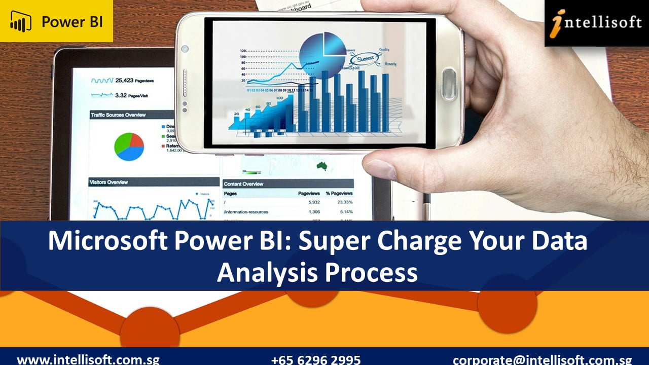
Microsoft Power BI: The Magic Wand To Vanquish All Your Data Analysis Problems
Super Fast
Dynamic, Interactive
Handle Big Data With Ease
Hundreds of Data Sources
Build Relationships. End of VLookups
Multiple Ways to Refresh
Visualize First
Generate Insights
Share With Ease
New Ways to Visualize – Maps, Tree Maps, Funnels, KPIs, Speedometers
Security of Sharing
Multi Device Support – Web, Desktop, Mobile, Tablet, Without installing any additional software
Real Time Processing
Multiple Dashboards
Slice & Dice To your Heart’s content
Article Written by Vinai Prakash, MBA, PMP, GAP, ACTA Certified
Suffering from Monday Morning Blues? Ever thought of a way of Managing Emails better ?
One of the key reason for these blues is the deluge of emails you will receive as soon as you open your Outlook Inbox. And then throughout the day, you will keep going to meetings & discussions… Every time you are back at your computer, the email overload keeps on increasing, giving you a nausea feeling of not being able to Manage Emails.
Outlook Mastery Training in Singapore
Suddenly your most important client calls. Have you taken action on the email they sent last week? You frantically search for the email, but can’t find it. Yes… you remembered to work on it when you received it, but then that email got lost in the jungle of never ending incoming email. Searching through thousands of email wastes more time.
Email has now become a burden for most people, and you are not alone. Most people feel frustrated, anxious, and are clueless as to where to start, or what is the solution to managing Emails in a Better way.
Actually, most of us spend an unusual amount of time using Microsoft Outlook. It has become a part of our daily lives.
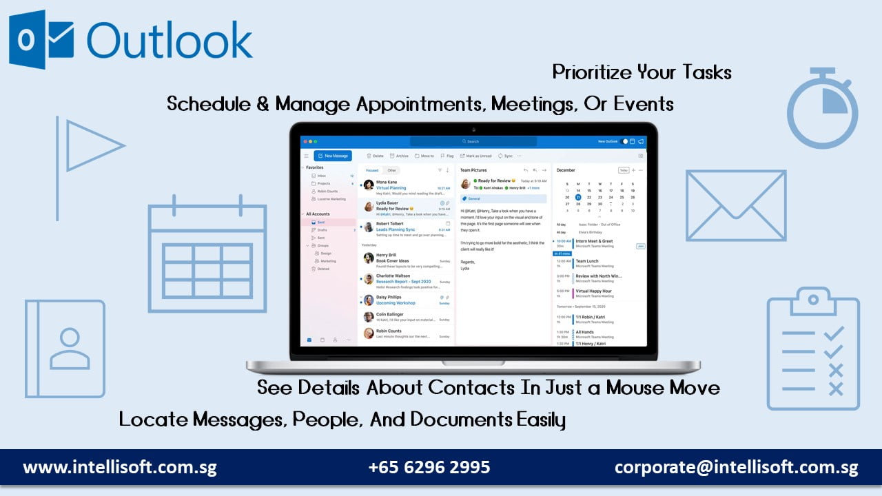
Microsoft Outlook is used for Managing Emails & Tracking several Items:
Meetings
Calendar
Tasks
Notes
Project Tracking
Surveys & Quick Polls,
Journal
Learn to Stay in Track With Microsoft Outlook: One day Workshop at Intellisoft Singapore Systems
And many people even share their calendars with their secretaries and colleagues, creating more management challenges.
To trace the root cause of the problem, most people are never taught how to organize things in their school or college days. Plus, a large population grew up before email became the mainstay of our work life. So we have just picked up email along the way, without knowing how to use it effectively or how to organize it correctly.
So What is the Better Solution For Managing Emails Effectively?
Fortunately, the answers are pretty easy, and we have been practicing them for several years. The solution is a combination of some best practices, some guiding principles, and some tips, tricks and shortcuts found within Microsoft Outlook or Gmail.
We also teach these basic Principles, Tips, Tricks and Secrets of Managing Emails Microsoft Outlook in a short, 1 day Outlook Mastery Training Seminar.
One common Solution, based on the principle of Single Processing is the one that brings you the most bang for the buck. What is Single Processing of emails? Let’s find out.
Email Mastery Principle #1: Single Processing of Emails For Better Management
Microsoft Outlook Training Singapore
Many people have the habit of scanning their emails first thing, reading them selectively, and then moving on to other, more interesting emails. Then they keep going back and forth between the important ones, and miss the others.
And as new emails come, the ones that you wanted to work on keep moving down, and out of sight. Once they are below the fold, we tend to forget them, until the boss or client calls to remind us.
The solution is to touch each email only once. And when you touch it, you decide what you want to do with it. We follow the 4D rule for easier processing.
What are the 4D – Do it, Delete it, Defer it & Delegate it. Let’s understand each one in more detail.
Do it:
If the email takes less than a couple minutes to do it, just do it. Postponing it, and then searching and fining it to do it later will simply take more time. It is faster to simply do it, just now. This simple principle alone will save you a huge amount of time. We call it the 2-Minute-Rule.
Delete it:
If the email is not useful, it is just some spam, or an FYI email, that you can dispose of after reading, then just delete it. Do not become a hoarder. Don’t keep each and every email you get. Most email may fall in this category.
What’s the fear in deleting it? If you can find the information from a colleague or easily find it in the shared drive or the Internet, then this email will simply take more space and more band width. Just get rid of it right away. That’s one less email to deal with in your email box.
Defer it:
If the email will require you to do some research, some more background work, and you don’t have the time to do it now, you can simply defer it to a later date and time. But don’t leave it here. Plan a time to do it.
Microsoft Outlook Training at Intellisoft
Then move the email to your calendar, and fix up a time. You can also create a Task in Outlook, and set a reminder at the date/time you’ll do it, so that Outlook will remind you to do it, and it actually happens.
If this email is part of a larger project, perhaps you can file it with other project related items – in a dedicated folder, or simply attach the relevant category to it. By doing this, you will be able to find it easily later on, in a single place.
Delegate it:
If you are not the right person to do it, you can delegate it to someone else – perhaps your secretary or a colleague who is more knowledgeable. If you do not have a large team, and do not have a secretary, you may not have this luxury. Do not worry.
Many simple tasks can be outsources to freelancers, or virtual assistants. If it is possible to delegate or outsource it, then do it immediately. And set a reminder for yourself, and for the delegate, so that both are aware of the delegation, and the due date/time.
These are simple tips and guides, and will help you immensely. And if you want to learn how to apply each of these techniques specifically to Microsoft Outlook, we invite you to attend our 1 Day Outlook Mastery Seminar in Singapore.
Want More Principles, Tips, Tricks & Shortcuts to Make Life Easier By Managing Emails With Microsoft Outlook?
Our 1 Day Outlook Mastery MasterClass is choke full of tips and tricks.
We cover the Best Practices for Managing Emails, Meetings, Tasks, Categories, Email Filing, a Good Folder System to file emails, Searching For Emails, and Getting Things Done to achieve more quickly in your life.
SkillsFuture Ready Training on Outlook Mastery
Eligible Singaporeans can use SkillsFuture for this course.And foreigners can attend these courses at our super low course fees too.
With Microsoft releasing new versions every 3 years, you may be wondering if you need to upgrade, and to what version. Many people are confused if they should buy Microsoft Office 2019 or Microsoft Office 365.
Here we list a few considerations that will help you choose the correct version of Office
The main difference between Microsoft Office 2019 and Office 365 is a cosmetic one – it’s about the license.
Microsoft Office 2019 is a perpetual license. You pay for it once, and then you use it forever. You don’t have to pay for it again.
Microsoft Office 365 is a subscription product. You have to pay a subscription fee monthly or annually to use it.
Now you may be thinking, pay once and use it forever is a better choice. Right?
But wait till you check out the pros and cons of a perpetual license of Microsoft Office 2019.
Benefits of Microsoft Office 365 Over Excel 2019
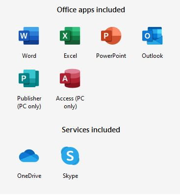
Office 365 Applications
Microsoft Office 365 is purchased directly online, from Microsoft. And the product receives continuous updates, new functions, features, charts, formulas etc. on a monthly basis.
In the beginning, both Microsoft Office 2019 and Office 365 are similar but give it a few months, and you will see new functions emerge in Office 365 that are not going to be there in Office 2019.
Microsoft has already released a fantastic function called XLOOKUP, which is only available if you subscribe to Office 365. This is a much better function than the most used VLOOKUP. With XLookup you can look up anything, from any column, left or right of the searched value, and this new function does EXACT match by default.
I would say that this function alone is sufficient to consider buying a subscription to Microsoft Office 365. And you get to install your Office 365 on 5 different devices, and you can share the same license with 5 other family members. Isn’t it amazing.
Plus, everyone gets 1TB worth of space on OneDrive – Microsoft’s Cloud storage solution.
Online Connection For Office 365?
And contrary to popular belief, you DO NOT NEED to be connected always to the Internet to use Office 365. You just need to connect to the Internet during the initial download and setup, and to sync your OneDrive or license for updates. There is no need to be online every time you have to use Office. Because Office 365 Home can be used offline. You only need an Internet access when installing and activating your office.
Our Recommendation for Office 365 or Microsoft Excel 2019
We would recommend that you choose a Subscription model Microsoft Office 365. It will be updated regularly, you get to share it, and the 1TB cloud storage is more than what Google Drive or Google Photos etc. give you for storing all your photos or documents.
Office 365 Training in Singapore
Once you have the software installed, make sure you learn the new functions & features of Excel added, so you can make the most of your Office 365 license. You can attend Office 365 Training in Singapore at Intellisoft Systems. We conduct training classes for Excel, Word, PowerPoint for Microsoft Office 2019 and Office 365.
You can join our public classes at Fortune Centre in Singapore, or if you have a group of people, we can conduct training at your office also.
The charts and dashboard created in Power BI make it easy for end-users to slice and dice it, visualize the data in any way.
While this is great, some care is needed on the part of the Power BI Dashboard Designers, to make sure that the data is understood in the correct way, and does not lead to any confusion or miscommunication due to the lack of presentation oversight.
Take control of Power BI Charts by manually configuring the Power BI visualizations, and gain more power.
Automatic scaling can mislead people into assuming that the data is all good, and may not yield clear comparison.
In Power BI Charts & Reports, the Vertical axis scales automatically, based on the current slicers, current data and filtered context.
To get more control over the axis, watch this important video tutorial on Power BI, and learn to fix the Y-axis to your advantage.
Tutorial Presented by
Vinai Prakash, Founder & Master Trainer at Intellisoft Systems, Singapore.
For more tips on Power BI, head over to our YouTube Channel, and subscribe to it, to be notified of latest videos and tutorials.
For tips on loading data from the result set of another query, you can use the Reference feature of Power Query. Power BI shows only rows where data is found. If you want to see all rows, you’ve got to see this tip on Showing Rows With No Matching Rows.
Learn Power BI From Practicing Professionals in Singapore
Intellisoft Systems conducts PowerBI training in Singapore each month. Do attend our hands-on practical training to learn Power BI from the beginning, and be able to analyze and visualize data easily with Microsoft tools.
Written & Presented by: Vinai Prakash, PMP, ACTA, ITIL, GAP, MBA
Vinai conducts the Microsoft Power BI training in Singapore. His Power BI courses are extremely popular, fun and easy to learn for beginners and experienced professionals alike.
Join Vinai in his next Power BI training course at Intellisoft. Hundreds of Power BI beginners, power analysts and super users have attended the training and benefited. You could be the next superhero with Power BI training!
Article Written by Vinai Prakash, MBA, PMP, GAP, ACTA Certified
Even though Power BI makes it extremely easy to load data from Excel and hundreds of other sources, clean it, and process it in any way, there are times when I wanted to do some testing, and bring in some test data.
I didn’t want to create Excel files and store them. I only wanted a simple way to bring in the data into Power BI.
Finally, I saw that Microsoft Power BI has actually thought about such a need, and there is a prominent button called Enter Data right on the Home screen.
I tested it out, and to my amazement, it worked perfectly. So I have been using it heavily in my work as a Power BI consultant, and architect of Power BI dashboards for our clients. Most importantly, this is one feature that our participants really loved in our Power BI classroom training.
So I recorded a short tutorial on how to use this nifty Enter Data feature of Power BI for your viewing pleasure, and for you to begin using it in your work.
Hope you found this tip useful.
For more tips on Power BI, head over to our YouTube Channel, and subscribe to it, to be notified of latest videos and tutorials.
Power BI shows only rows where data is found. If you want to see all rows, you’ve got to see this tip on Showing Rows With No Matching Rows.
Learn Power BI From Practicing Professionals in Singapore
Intellisoft Systems conducts PowerBI training in Singapore each month. Do attend our hands-on practical training to learn Power BI from the beginning, and be able to analyze and visualize data easily with Microsoft tools.
Written & Presented by: Vinai Prakash, Founder & Master Trainer, Intellisoft Systems
Vinai conducts the Microsoft Power BI training in Singapore. His Power BI courses are extremely popular, fun and easy to learn for beginners and experienced professionals alike.
Join Vinai in his next Power BI training course at Intellisoft. You won’t regret it!
Free Tips, Tutorials & Training Grants Info
Learn from expert tips, tricks and resources for Excel, PowerPoint, Photoshop, Python, Power BI, Project Management, IT, Soft Skills & more with our Email Newsletter. Plus get the latest news on Grants. Join Today!